Top Ideas That Elevate Home Painting Projects With Lasting Appeal
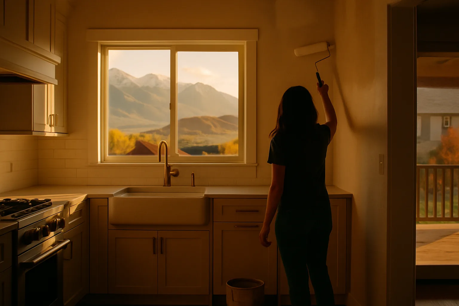
A great paint job changes how a room feels and how long it looks fresh. The smartest upgrades mix bold color choices with careful prep so the finish stays beautiful for years.
A great paint job changes how a room feels and how long it looks fresh. The smartest upgrades mix bold color choices with careful prep so the finish stays beautiful for years.
Color Has Momentum Again
We are living through a color comeback. A leading design magazine’s 2025 report points to the end of beige-on-beige and a surge of confident hues, which means your next project can lean into richer palettes without feeling risky. Treat color like a tool for mood and function, not just decoration.
Choose Finishes With Staying Power
Long-lasting paint starts with the right product for the job. Kitchens and baths deal with water and scrubbing, so durable, washable formulas earn their keep. In low-traffic bedrooms, a softer, more matte look can hide minor wall flaws and still feel calm.
Think beyond the can. A primer that matches the task reduces coats and improves adhesion. Good tape, clean rollers, and a quality brush are not extras - they are insurance against fuzzy lines and early touch-ups.
Use Contrast to Shape Space
Contrast is design’s quiet superpower. Deep trim with lighter walls can sharpen period details, and pale trim with mid-tone walls softens edges for a modern, airy feel.
Darker doors against gentle neutrals turn forgettable surfaces into architecture. The simplest place to test contrast is a single focal plane.
Many rooms benefit from strategic color on one surface. Try painting an accent wall where natural light skims and furniture lines stay clean - then echo that hue in textiles for balance. Keep adjacent walls related in temperature so the transition feels intentional rather than abrupt.
High-contrast palettes help guide the eye, creating a natural rhythm as you move through the room. Subtle shifts in value can zone open-concept spaces without adding physical dividers.
If you're unsure how bold to go, start with contrast in smaller elements like lamps, frames, or side tables. This lets you gauge how the room absorbs deeper tones before committing to larger surfaces.
Plan a Palette That Works Room to Room
Cohesion makes a home feel bigger. Pick one anchor color family, then vary the depth from room to room so the eye experiences continuity without boredom. Sample generously and look at swatches in morning, afternoon, and evening light before you commit.
If you are drawn to saturated colors, temper them with grounded neutrals on trim or ceilings. That balance keeps bold choices feeling intentional rather than loud. In open plans, repeat one trim color to tie zones together even when wall colors shift.
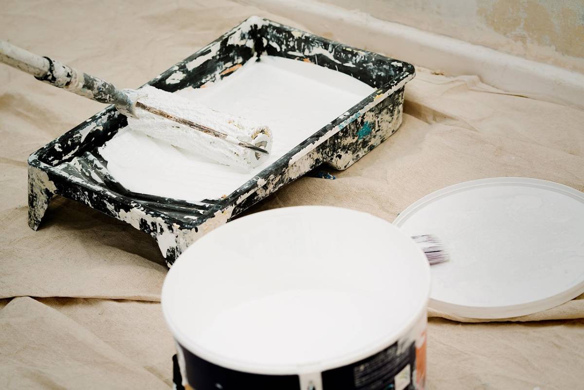
Nail Prep and First Coats
Great results are 70 percent preparation and 30 percent painting. Clean walls, de-gloss glossy areas, and fill dings so the texture looks consistent once the light hits. Sand lightly between steps and vacuum dust before the first coat.
-
Wash walls and let them dry fully before priming.
-
Spot-prime repairs, then apply a full-coat primer for color changes.
-
Cut in carefully, maintain a wet edge, and roll from dry to wet to avoid lap marks.
Give coats enough time to cure. Rushing recoat windows traps water and invites early scuffs. A little patience here pays you back every time the sun strikes across the wall.
Sheen and Light Do the Heavy Lifting
Sheen changes how color reads. Flat and matte finishes mute texture and hide small imperfections, and satin and eggshell add a touch of light bounce that helps rooms feel open. In high-touch zones like hallways, a subtle step up in sheen makes cleaning easier without a plastic look.
Think about the light story. North-facing rooms cool colors down; south-facing rooms warm them up. Adjust undertones accordingly so the color you loved in the store is the color you live with at home.
Healthy Homes Start With Low-VOC Choices
Indoor air quality matters during and after a project. Environmental health guidance notes that concentrations of many volatile organic compounds can be much higher indoors than outdoors, during painting.
Choose low-VOC or zero-VOC primers and topcoats, ventilate well, and let rooms dry with fans or open windows before heavy use.
Plan your sequence with health in mind. Paint bedrooms and nurseries early so they can cure before anyone sleeps in them. Store leftovers in tightly sealed cans away from living areas, and dispose of solvents at approved sites rather than in household trash.
Maintenance Habits That Protect the Finish
A little care extends the life of your work. Dust high-traffic walls with a dry microfiber cloth, then spot-clean with a damp sponge and mild soap. Avoid harsh scrubbing pads that burnish matte finishes or create shiny patches.
Touch-ups blend better when you label the can with room, wall, and date. Keep a small, airtight jar of the final color for quick fixes on nicked corners and banisters.
When traffic patterns change, think about a fresh coat on the first 36 inches up from the floor instead of repainting the entire space.
Details That Make Rooms Feel Designed
Ceilings are the fifth wall. A barely-tinted ceiling in the wall color softens contrast lines and can make low rooms feel taller.
On trim, one consistent white across the home ties styles together, even if rooms shift from cottage to contemporary.
Mind junctions and transitions. Color-blocking on inside corners creates crisp zone changes in open layouts. Painted interior doors - even in quiet neutrals - add rhythm to long hallways without overwhelming small spaces.
When to Go Bold, When to Hold Back
Bold color shines where daylight and clean lines keep things readable. Libraries, dining rooms, and powder baths can handle deeper hues, with warm lamps at night. If the room is small and clutter-prone, lower contrast and simpler palettes often look fresher longer.
Test your risk tolerance with large poster boards rather than tiny chips. Live with them for a few days, notice your mood, and check how art and furniture react. Good color should support your routines, not compete with them.
A lasting paint upgrade comes from a smart plan more than a flashy swatch. Choose colors with intention, prep like a pro, mind air quality, and keep a short maintenance rhythm. With those habits in place, your rooms will look considered and stay beautiful long after the drop cloths are gone.
Keep reading
More from the blog

Best Vessel Sink Brands for Every Bathroom Style

Housing Market Shift in 2026: Rates, Affordability & What's Next

Zillow 2026 Forecast: What Falling Home Prices Mean for Buyers & Sellers